


NATE'S NEMESIS: MONSTER ATTACK is a tower defense game designed for the iOS platform. During internship at Sheridan College, our client, Warren Currell (SHERPA GAMES), had asked us to create a game that his son had conceptualized when really young.
MONSTER ATTACK is about a mutant squirrel that lays siege to cities all over the world. Your task as commander is to stop the threat and guide your troops into action.
Content is inspired by Godzilla franchise and gameplay is heavily inspired by the iOS game Flight Control (Firemonkeys Studios).


TORONTO
2D ANIMATION
THE TRAILER

Originally taken on as the teams only artist, I was tasked with defining the over all art style/direction of the game.
Once we were able to take on a new artist (the lovely Katherine Elliot), my focus shifted from in-game art to a trailer that our client wished to show off at GDC 2016.
The trailer seen above was animated entirely in Photoshop, frame by frame, with the exception of the gameplay footage near the end.
At the time, Photoshop was all I knew how to animate in, I have since learned of new software and am always looking into industry standards and new techniques to apply to my future work.
UI DESIGN
MENU UI
I was responsible for all of Monster Attack's menu UI. The design intention for the UI was inspired by the army tactician's perspective where maps, papers and wooden figures are laid out on a desk.
Below are some concept images for the game's start screen as I was working on getting a feel for the design.


Before settling on anything concrete I did some in-house testing with my team members. I had used Powerpoint as a means of prototyping and communicating my ideas to the rest of the team. This allowed me to visualize transitioning between different states and menus in the game a lot easier. A copy of the Powerpoint prototype can be found in the file right.
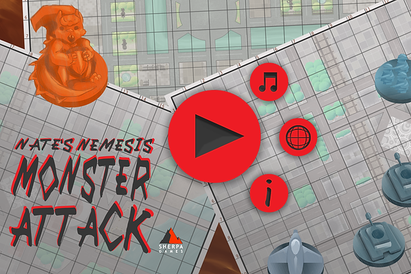
The image above became the game's official start screen and desired aesthetic for the game's UI and the menus to follow were made to suit this art direction.


Levels could be selected by picking a folder marked with a location. Once chosen the folder would open and reveal a map of the destination and a break down of the main objectives for that level, as seen below.


Overall, working on this project was a great learning experience and was an integral part of discovering my passion for making games as a UI designer.
